
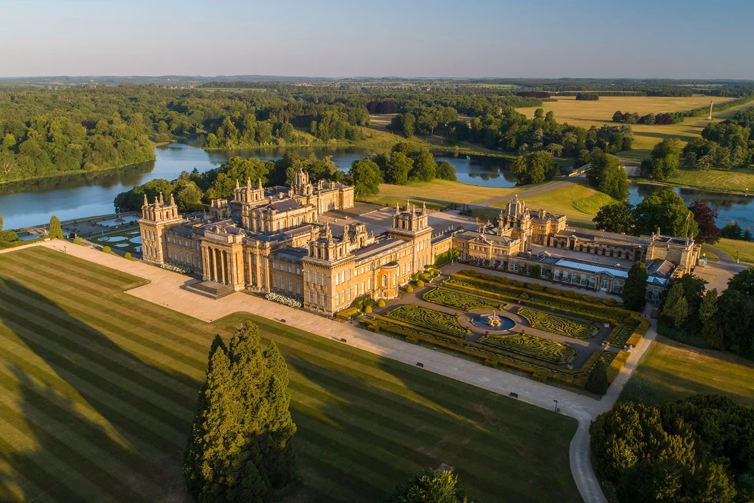
清晨,当阳光缓缓洒落在布伦海姆宫上空,一切都显得那么平静祥和,没有丝毫突兀之感。
光线以沉稳的姿态缓缓显现——先是淡淡的银光柔化了湖面,随后温暖的漫射光轻抚着南立面的雕花,最后,金色的光晕轻柔地洒落在卡帕比尔·布朗精心雕琢的草坪上。在布伦海姆宫,色彩并不张扬,它静静地沉淀、舒展、升华。这片色彩的调色板,是由几个世纪以来英国的阳光、风化的石灰岩以及为传承历史而建造的建筑的静谧与永恒共同塑造而成。
这里的庄园布局既宏伟又含蓄。
层层叠叠的露台如同精心设计的线条;柱廊交错,光影变幻;水面倒映着天空,宁静祥和。一切都显得浑然天成,却又不显刻意——宫殿巍峨壮丽却又不失柔和,景观设计精巧却又自然流畅。如果说峰区是由风雨雕琢而成,那么布伦海姆宫则是匠心独运、对称美学和英国传统工艺的结晶。
At midday, the palace becomes a study in controlled luminosity.
Golden limestone shifts between pale cream and warm honey. Courtyard shadows move with disciplined geometry. The lake reflects skies in tempered blues rather than bold saturation. Clouds, constant sculptors of British light, pass over the estate like slow strokes of a brush, softening contrast, diffusing edges, and giving architecture the gift of atmosphere. What seems stately is actually a dialogue between stone and air, design and nature, history and light.

From this monumental estate emerges a refined chromatic vocabulary distinctly its own:
- Blenheim Honey — warm limestone kissed by centuries of sun.
- Architect’s Cream — quiet, dignified neutrals shaped by age and craftsmanship.
- Gilded Crest Gold — antique, muted metallic warmth echoing aristocratic emblems.
- Vanbrugh Shadow — structured grey beneath colonnades and carved wings.
- Capability Green — cultivated landscape hues—soft, layered, architecturally calm.
- State Room Burgundy — ceremonial reds softened by tapestry and candlelit air.
- Library Oak Brown — deep, polished wood filtering warm interior light.
- Lake Reflection Blue — desaturated blues shaped by fog, depth, and silence.
- Winter Fountain Silver — frost-toned greys over statuary and stone basins.
- Formal Garden Rose — delicate, cultivated pinks lining summer parterres.
- Ink Corridor Black — near-black shadows lengthening through high vaulted halls.
- Candle Smoke Taupe — the soft haze of interiors shaped by tradition and time.
Each color is less a standalone hue and more an archive—
a record of architecture meeting atmosphere, heritage meeting weather, time meeting texture.
“Blenheim Honey” is not merely gold; it is sunlight filtered through stone.
“Vanbrugh Shadow” is not simply grey; it is the geometry of design made visible.

At night, the palace shifts into a world of restrained contrast.
Edges dissolve into silhouette; windows glow in muted amber; water darkens into ink.
“Lake Reflection Blue” deepens into near-black velvet; “Winter Fountain Silver” becomes a ghost of light.
Yet even in darkness, the estate holds color—soft, contemplative, enduring.
For designers, artists, and formulators, the palette of Blenheim Palace becomes a lesson in imperial subtlety—a color system built not on spectacle, but on composure, balance, and a quiet form of authority.
This is a landscape that invites the question:
How does grandeur behave when stripped of excess?
How does power express itself through restraint rather than brilliance?

When the colors of Blenheim Palace enter Yichun Gel Factory’s chromatic engineering pipeline, they encounter another form of precision—controlled curing temperatures, resin clarity testing, pigment particle calibration, and laboratory-level reproducibility. The palace’s quiet gold becomes viscosity adjustments; its cultivated greens become balanced opacity; its architectural shadows become pigment density curves.
Yichun’s principle is not imitation—it is translation.
The goal is to preserve what gives these colors cultural gravity:
Depth — shades that hold the weight of stone and engineered landscape.
Controlled Warmth — tones that feel historic rather than decorative.
Architectural Texture — matte qualities reminiscent of limestone; glossy clarity echoing still water.
Emotional Temperature — dignified, composed, classical, timeless.

Thus, the Blenheim palette enters functional gel systems:
Blenheim Honey, Architect’s Cream, and Candle Smoke Taupe become builder gels and rubber bases—soft, stately neutrals that elevate natural nails without overwhelming them.
Capability Green, Formal Garden Rose, and Winter Fountain Silver transform into jelly tints and soft opaques—expressive yet controlled, perfect for elegant overlays.
Vanbrugh Shadow, Lake Reflection Blue, and Library Oak Brown evolve into structured opaques—cool, engineered, balanced like architectural materials.
State Room Burgundy and Ink Corridor Black form the deep, ceremonial tones of the collection—rich, heritage-inspired, and stable under both warm and cool lighting.
Each formulation undergoes behavioral evaluation:
Does the matte shift resemble stone or powder?
Does the opacity feel structural rather than cosmetic?
Does the gloss echo water, not plastic?
Do undertones maintain composure under studio lights?
These micro-decisions determine whether a shade feels merely pretty or truly Blenheim.

Within Yichun’s product ecosystem, the Blenheim Palace narrative becomes four flagship series—each reflecting a distinct facet of the estate’s character.
1. Imperial Limestone Builder & Base Series
Inspired by Blenheim Honey, Architect’s Cream, and Candle Smoke Taupe.
These tones behave like stone—steady, timeless, foundational.
Designed for salon reliability, they offer:
- Medium-build structure
- Subtle warm undertones
- Architectural neutrality
- Universally flattering balance
They bring to nails the composure of limestone façades and the quiet warmth of morning light across the palace walls.
2. Heritage Garden Jelly Veil Collection
Drawn from Capability Green, Formal Garden Rose, Winter Fountain Silver, and Lake Reflection Blue.
These jellies echo the atmosphere of the estate’s gardens—soft, moisture-laced, illuminated by diffused sun.
Their qualities include:
- Veiled translucency
- Mist-like diffusion
- Gentle, cultivated elegance
Perfect for watercolor techniques, airy gradients, and designs mirroring the estate’s serene landscape compositions.
3. Vanbrugh Shadow Sculpted Opaque Line
Named for architect Sir John Vanbrugh, inspired by Vanbrugh Shadow, Ink Corridor Black, and Library Oak Brown.
These are the tones of carved wings, grand halls, and corridors shaped by candlelit silhouettes.
Expect:
- Strong opacity
- Clean edges
- Sculptural depth
They are shades with structure—quietly powerful, precise, and modern in their heritage.
4. Gilded Crest Lumi-Shine Toppers
Inspired by Gilded Crest Gold, State Room Burgundy, and Winter Fountain Silver.
These toppers capture the refined sparkle of ceremonial halls and antique metallic finishes.
Their behavior:
- Micro-reflective shimmer
- Luxurious but not loud
- Movement reminiscent of light on polished ornament
Perfect for elevating minimalist manicures or adding aristocratic accents.
Across these four series, the design ethos stays constant:
composure, refinement, atmospheric depth, and timeless wearability.

To honor the heritage of Blenheim Palace, packaging draws from its materials, craftsmanship, and spatial language.
Primary Box Tones
- Blenheim Honey Matte — warm, stone-like surface with powdery tactility.
- Vanbrugh Shadow Grey — embossed with subtle grain patterns.
- Formal Garden Rose — an understated accent spine.
Bottle Design
- Matte limestone-textured surfaces reminiscent of façades.
- High-gloss caps reflecting the palace lake.
- Soft-touch finishes echoing candlelit interiors.
Print & Finishing
- Embossed serif typography inspired by estate signage.
- Antique gold foil referencing aristocratic crests.
- Selective matte-gloss interplay to simulate the way light travels across carved stone.
Color Card Layout
Horizontal swatches arranged like architectural elevations—clean, layered, intentional.
Thin separators mimic colonnade spacing.
Soft gradients suggest morning mist, long shadows, and the estate’s gentle rises.
The system communicates heritage, composure, and British sophistication.

布伦海姆宫的戏剧性不在于其华丽,
而在于其存在感——
石头的沉稳、对称的精准,以及温暖光线下所承载的历史情感。
It teaches that:
色彩若能完美掌控,便能展现强大的力量。
宏伟并不一定需要饱和度。
优雅在于温暖与内敛之间的平衡。
传统色调蕴含着无法人工复制的情感深度。
氛围与色彩本身同样重要。
For global creators, Blenheim Palace becomes a metaphor for timeless luxury—a palette that enhances rather than overwhelms, that defines rather than distracts.
It is color designed not to impress, but to endure.
📍 Location
布伦海姆宫,伍德斯托克,牛津郡,英格兰
坐标:北纬51.8413°,西经1.3620°