
Short Introduction
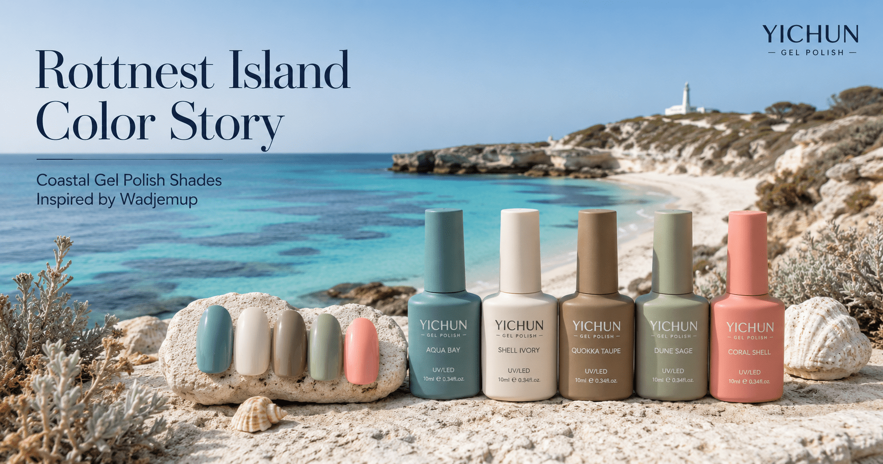
Rottnest Island, also known as Wadjemup, offers a coastal color story built on clear water, pale sand, limestone paths, salt-lake softness, low coastal scrub, and the warm neutral tones of the quokka. Located off the coast of Western Australia, the island is known for its aquamarine bays, protected natural environment, and distinctive wildlife identity.
For a gel polish collection, Rottnest Island is not only a beach palette. It is a balanced commercial concept: fresh ocean blues for seasonal visibility, creamy neutrals for everyday salon wear, soft animal-inspired taupes for warmth, and muted greens for natural sophistication.
This Rottnest Island gel polish color story can help private label nail brands create a collection that feels coastal, friendly, clean, and commercially wearable, while still carrying a strong visual identity.
Atmosphère d'ouverture
Rottnest Island begins with light.
The color is not heavy or dramatic. It feels open, sun-washed, and breathable. The water shifts between glassy turquoise, pale aqua, and deeper marine blue. The sand is soft rather than golden, closer to shell cream and limestone ivory. Around the paths and dunes, coastal shrubs bring muted sage, dry olive, and weathered green.
Then there is the quokka: small, warm-toned, and instantly recognizable. Its fur introduces a different kind of softness into the palette — sandy taupe, warm grey-brown, toasted beige, and gentle shadow brown. These are not loud animal colors. They are quiet, natural, and highly usable for nail products.
The overall mood is relaxed but refined. It suggests a collection designed for summer salons, resort nail menus, coastal gift sets, vacation capsules, and everyday nude ranges with a fresh island accent.

Cultural and Geographic Context
Rottnest Island / Wadjemup sits off the coast of Western Australia near Perth and Fremantle. Tourism Australia describes it as a protected nature reserve with white-sand beaches, clear water, marine life, and the island’s famous quokka population. Western Australia’s official tourism site also highlights its aquamarine bays, walking trails, bike tracks, and conservation-minded island setting.
The island also carries a deeper cultural history. Wadjemup is not only a holiday destination; it is a place of significance to Aboriginal communities. Official Rottnest Island Authority information records that Aboriginal people were transported to the island for incarceration from 1838 to 1931, with thousands held there during that period.
For a Color Stories article, this means the design approach should be respectful. The collection should not reduce the island to a cute animal image or a simple beach postcard. A stronger product concept should recognize the island’s layered identity: sea, sand, wildlife, salt lakes, limestone, stillness, and cultural memory.
In commercial beauty language, Rottnest Island becomes a palette of softness, openness, and restraint. It is ideal for brands that want coastal color without excessive tropical saturation.
The Visual Color System of the Place
Rottnest Island creates color through contrast between water clarity and dry island texture.
The strongest visual family is blue. The water around the island moves from pale lagoon aqua to vivid turquoise and deeper Indian Ocean blue. These tones are ideal for jelly gel polish, shimmer gel, cat eye accents, and reflective summer shades.
The second family is sand and limestone. Shell ivory, soft beige, chalk white, and sun-warmed cream give the palette commercial balance. These colors work well for nude gel polish, milky gel, builder gel shades, and salon-friendly everyday manicures.
The third family comes from the quokka and coastal earth. Warm taupe, dry brown, mushroom grey, and soft animal-fur beige add warmth. These shades make the collection more wearable, especially for brands selling to salons that need natural colors beyond bright seasonal blues.
The fourth family is coastal vegetation. Sage green, dune grass, muted olive, and dry eucalyptus tones bring quiet sophistication. These are not forest greens. They are lighter, dustier, and more suitable for soft matte manicures or neutral color blocking.
The final family is sunset and coral accent. Peach, coral shell, warm apricot, and soft rose appear in evening light, beach shells, and warm island reflections. These shades help the collection feel feminine, friendly, and retail-ready.
Signature Color Palette
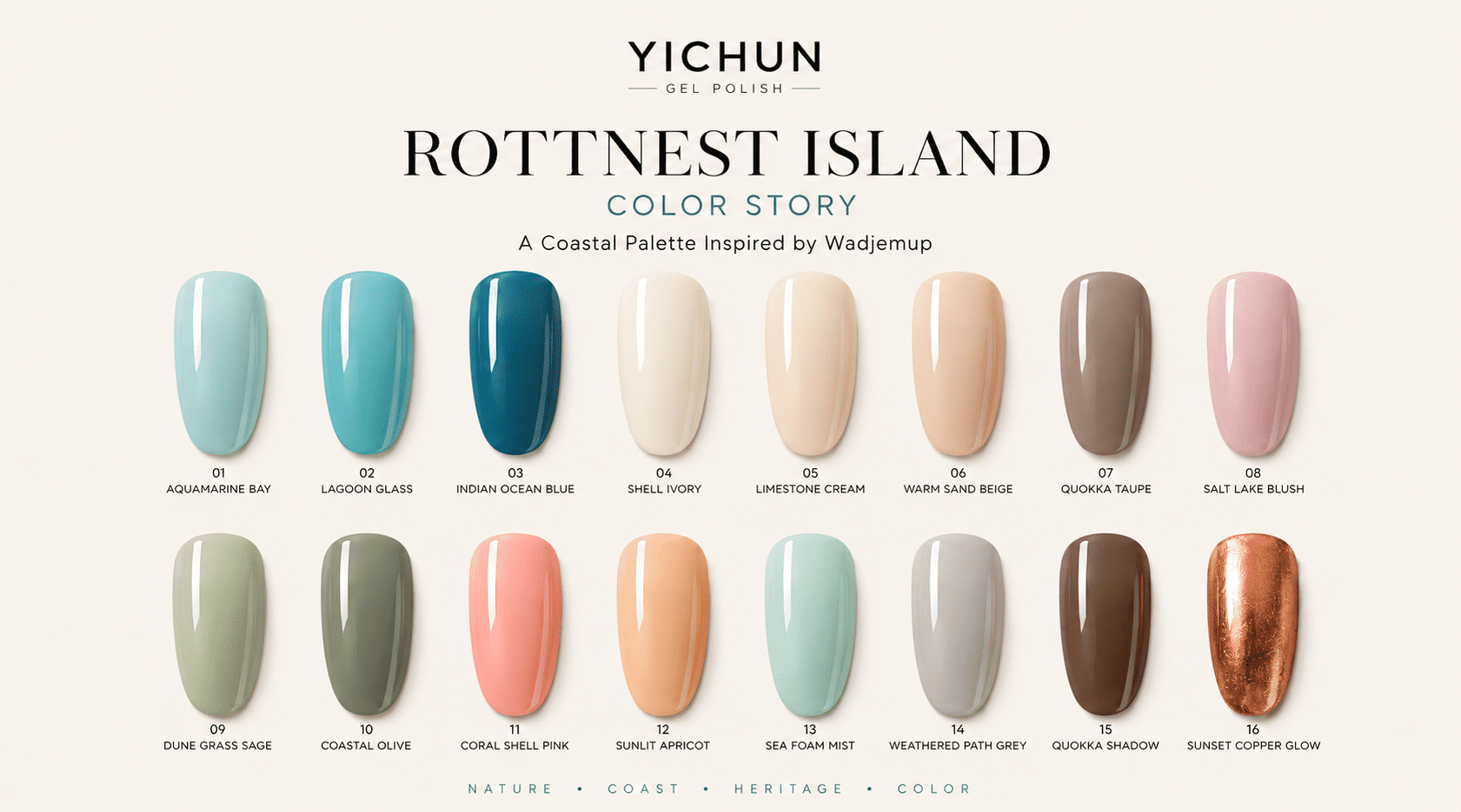
Signature Palette
- Wadjemup Aqua — a clean lagoon aqua inspired by shallow island water, ideal for jelly gel polish and summer salon sets.
- Quokka Taupe — a warm grey-brown drawn from quokka fur, useful for nude collections, short nail manicures, and soft neutral branding.
- Shell Ivory — a creamy off-white inspired by pale sand and shell fragments, suitable for milky gel, French tips, and bridal nail designs.
- Limestone Cream — a soft beige-white shade that reflects the island’s limestone paths and sunlit buildings, ideal for minimalist salon collections.
- Indian Ocean Blue — a deeper marine blue that adds structure and contrast to the palette, suitable for full-color manicures and cat eye gel effects.
- Lagoon Glass — a translucent blue-green shade designed for jelly layering, water-inspired nail art, and resort-themed collections.
- Salt Lake Blush — a muted pink-beige tone inspired by inland salt-lake softness, strong for feminine nude sets and everyday wear.
- Dune Grass Sage — a dusty coastal green inspired by low island vegetation, suitable for matte top coat finishes and calm natural palettes.
- Coastal Olive — a dry green-brown accent that gives the collection a more mature, editorial quality.
- Warm Sand Beige — a best-selling commercial neutral that can support nude gel polish, rubber base shades, and builder gel color systems.
- Sunlit Apricot — a soft orange-peach shade inspired by late afternoon island light, ideal for spring and summer capsule collections.
- Coral Shell Pink — a wearable coral-pink accent that adds retail friendliness without making the collection too bright.
- Sea Foam Mist — a pale blue-white tone suitable for milky, pearl, shimmer, and soft gradient nail designs.
- Weathered Path Grey — a light neutral grey inspired by island paths and weathered stone, useful for balancing stronger blue and coral shades.
- Quokka Shadow Brown — a deeper warm brown that gives the palette depth and works well for autumn transition sets.
- Sunset Copper Glow — a warm metallic accent shade suitable for shimmer gel, reflective glitter, or chrome pairing.
From Landscape Color to Gel Polish Collection
A professional Rottnest Island gel polish collection should not be built only with blue shades. If the collection contains only aqua, turquoise, and ocean blue, it may look attractive in campaign images but become less practical for salon and distributor sales.
The stronger approach is to divide the palette into commercial product families.
Core Identity Colors
Wadjemup Aqua, Lagoon Glass, Indian Ocean Blue, and Sea Foam Mist define the coastal identity of the collection. These shades communicate freshness, water clarity, and island atmosphere. They are the best colors for hero visuals, website banners, seasonal campaign images, and social media launch content.
Commercial Best-Seller Colors
Quokka Taupe, Warm Sand Beige, Salt Lake Blush, Shell Ivory, and Limestone Cream make the collection easier to sell. These shades support nude manicures, daily salon services, bridal sets, short nail looks, and professional clients who prefer softer tones.
Natural Accent Colors
Dune Grass Sage, Coastal Olive, Weathered Path Grey, and Quokka Shadow Brown add maturity. These colors prevent the collection from feeling too sweet or too holiday-focused. They are suitable for nail brands that want coastal beauty with a premium, grounded identity.
Seasonal Highlight Colors
Sunlit Apricot, Coral Shell Pink, and Sunset Copper Glow bring warmth and retail energy. They can be used for limited seasonal promotions, summer gift sets, vacation capsules, and nail art combinations.
Collection Logic
For a private label launch, this palette could work as a 12-color starter collection, a 16-color seasonal set, or a wider 24-color coastal series. The most commercial version would combine ocean-inspired shades with nude and taupe tones, giving salons both visual excitement and everyday usability.
Nail Design Application
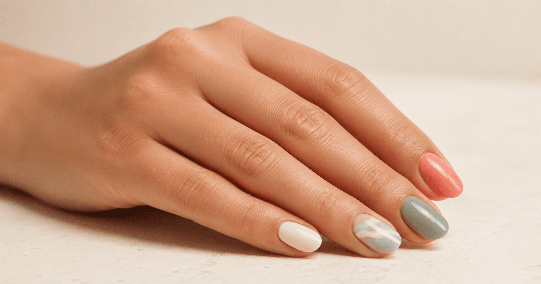
The Rottnest Island palette is flexible because it supports both soft daily manicures and more visual editorial nail art.
For everyday salon use, Quokka Taupe, Warm Sand Beige, Salt Lake Blush, and Shell Ivory can be used as full-color manicures. These shades are suitable for short nails, office-friendly looks, bridal services, and natural nail enhancement.
For resort and summer designs, Wadjemup Aqua, Lagoon Glass, Sea Foam Mist, and Indian Ocean Blue can be layered into water-inspired gradients. A jelly blue base with a shimmer top effect can create the feeling of clear shallow bays without looking too heavy.
For modern nail art, Dune Grass Sage and Coastal Olive can be paired with Shell Ivory or Weathered Path Grey for calm color-block designs. This combination works especially well with matte top coat finishes.
For premium editorial looks, Indian Ocean Blue can be paired with Sunset Copper Glow. The contrast between cool marine depth and warm metallic light gives the collection a stronger campaign image, suitable for hero photography and social media product launch visuals.
A quokka-inspired neutral set could also become a separate salon capsule: Quokka Taupe, Warm Sand Beige, Salt Lake Blush, Quokka Shadow Brown, and Shell Ivory. This direction gives the collection a warm, friendly identity while remaining highly wearable.
Product Type Recommendation
This color story can support several YICHUN gel polish product systems.
Classic color gel polish is the foundation. The nude, taupe, coral, sage, and blue shades can all be developed as opaque or semi-opaque color gels for salon use.
Jelly gel polish is especially suitable for the water-inspired shades. Wadjemup Aqua, Lagoon Glass, and Sea Foam Mist can be developed with translucent depth to express clear water, shallow bays, and light movement.
Shimmer gel polish can add coastal brightness without becoming too glitter-heavy. A soft pearl shimmer can work well with Sea Foam Mist, Shell Ivory, and Coral Shell Pink.
Cat eye gel polish can be used selectively for Indian Ocean Blue or Sunset Copper Glow. These shades would create stronger light movement for campaign visuals and premium nail art.
Builder gel or BIAB-style color bases can use Quokka Taupe, Warm Sand Beige, Salt Lake Blush, and Limestone Cream. These shades are practical for salons because they combine color, structure, and natural wearability.
Matte top coat is important for the sage, taupe, olive, and limestone-inspired colors. It gives the collection a more editorial finish and prevents the palette from feeling like a basic beach theme.
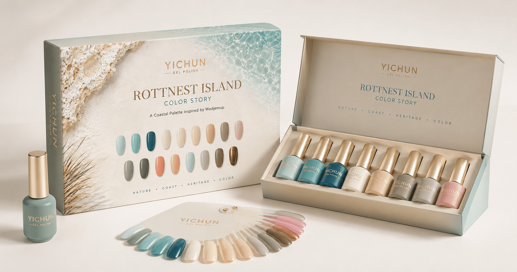
Packaging and Brand Visual System
The packaging direction should feel clean, coastal, and premium. It should avoid cartoon quokka illustrations unless the brand specifically wants a playful retail direction. For B2B private label development, a more refined system will be stronger.
Bottle Design Direction
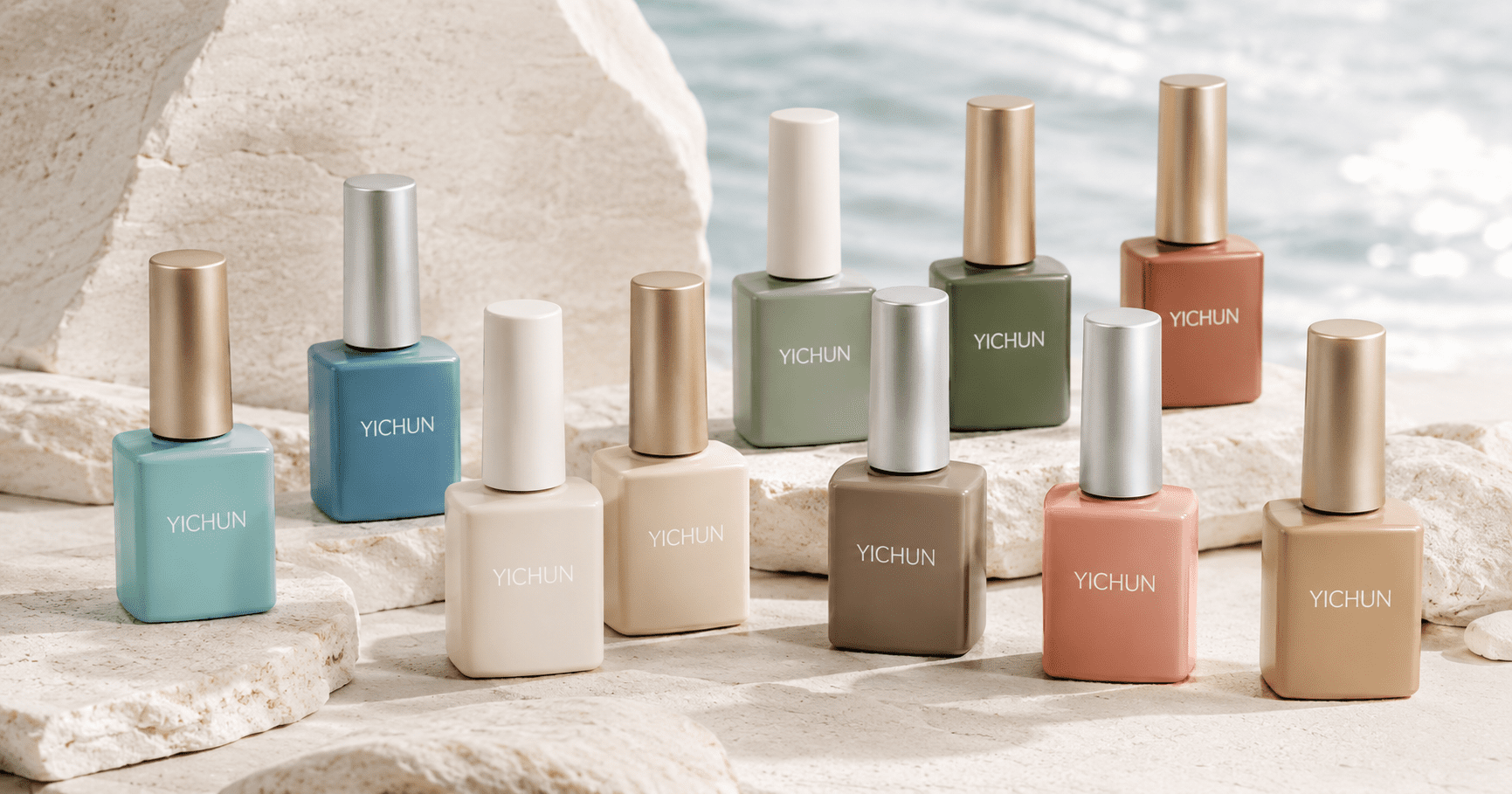
Opaque gel polish bottles are recommended because gel polish is light-sensitive. For this collection, the bottle body can use soft color-matched finishes: aqua, sand beige, shell ivory, taupe, sage, and marine blue.
Caps can be matte white, brushed silver, champagne gold, or soft pearl grey. A clean YICHUN logo in minimal typography would match the island’s calm visual tone.
Box Design Direction
The outer box can use a matte pearl or soft sand texture. Subtle wave lines, limestone grain, or salt-lake inspired patterns can be embossed tone-on-tone. A silver foil or champagne foil YICHUN logo would be suitable.
For a premium private label set, a drawer box or magnetic rigid box could hold 12 or 16 shades with an inner tray. The tray could be paper card, EVA, or molded insert depending on the buyer’s target price and brand positioning.
Color Card Direction
The color card should organize shades by product family: Ocean Lights, Quokka Neutrals, Coastal Greens, and Sunset Accents. This makes the collection easier for distributors and salons to understand.
A professional A4 color sheet, salon ring, or foldable shade card would help buyers present the collection during wholesale meetings, salon training, and online product listing creation.
OEM / Private Label Development Value
For nail brands, the commercial value of a Rottnest Island color story is its balance between emotional identity and sellable shade planning.
The quokka gives the story recognition, but the collection should not depend only on animal cuteness. The real product value comes from the full palette system: ocean blues for visibility, neutrals for sales stability, greens for sophistication, and coral accents for seasonal freshness.
YICHUN can translate this type of landscape-inspired concept into a private label gel polish collection through custom colors, bottle finishes, packaging design, color cards, and collection planning. For brand owners, this means the final product line can feel more complete than a random shade assortment.
This concept is suitable for summer launches, coastal salon collections, travel-inspired nail campaigns, distributor sample kits, resort retail sets, and private label beauty brands that want a clean, friendly, premium island identity.
A strong color story gives a gel polish collection a reason to exist. It helps buyers understand the mood, helps salons explain the colors to clients, and helps brands build stronger product photography, packaging, and marketing content.
FAQ
1. What is the Rottnest Island gel polish color story?
The Rottnest Island gel polish color story is a nail collection concept inspired by Wadjemup’s clear coastal water, pale sand, limestone textures, salt-lake softness, coastal vegetation, and quokka-inspired warm neutrals. Instead of using only beach blue shades, the palette combines ocean tones with wearable nudes, taupes, greens, and coral accents.
2. Why is Rottnest Island suitable for a gel polish collection?
Rottnest Island is suitable because its color system is visually recognizable and commercially balanced. The island offers fresh aqua and blue shades for seasonal appeal, while quokka taupes, sand beige, shell ivory, and salt-lake blush make the collection wearable for daily salon use. This balance is important for private label nail brands.
3. What nail colors should be included in this collection?
A strong Rottnest Island-inspired collection should include aqua blue, lagoon green-blue, marine blue, shell ivory, limestone cream, warm sand beige, quokka taupe, salt-lake blush, dune sage, coastal olive, coral pink, soft apricot, and copper shimmer. These colors can be developed as classic gel polish, jelly gel, shimmer gel, builder gel colors, or seasonal capsule shades.
4. Can this palette work for salons and distributors?
Yes. The palette works well for salons because it includes both statement colors and practical daily shades. Distributors can also position it as a coastal summer collection, nude-plus-blue capsule, resort nail set, or private label seasonal launch. The mix of wearable neutrals and fresh water shades makes it easier to sell across different customer groups.
5. Can YICHUN develop this as a private label gel polish collection?
Yes. YICHUN can use this type of color story as a development direction for custom gel polish shades, opaque bottle design, packaging concepts, color cards, and product set planning. A buyer could develop it as a 12-color starter set, 16-color seasonal collection, or larger private label range.
6. What packaging style works best for this color story?
The best packaging style would be clean, coastal, and premium. Matte sand-textured boxes, pearl finishes, subtle wave patterns, limestone-inspired embossing, and silver or champagne foil YICHUN logos would match the Rottnest Island mood. The packaging should feel refined rather than cartoon-like, especially for professional B2B private label buyers.
Location: Rottnest Island / Wadjemup, near Perth and Fremantle, Western Australia, Australia.