
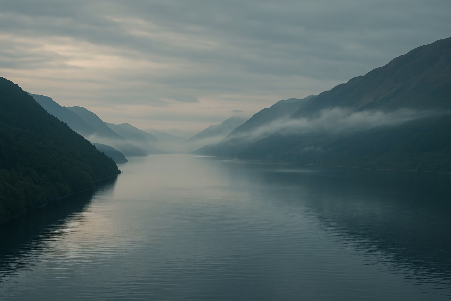
Before daylight fully wakes the Scottish Highlands, Loch Ness lies in a state between shadow and breath.
A soft blue-grey mist drapes itself over the long, narrow waterway—almost reluctant to rise—as if the loch is safeguarding something ancient beneath its surface. The first glimmers of morning light touch the ridgelines in muted silver, revealing slopes that look sculpted by fog and memory rather than weather alone. This Loch Ness color story begins with quiet depth: no rippling crowds, no bright reflections, only a stretch of dark water and the low hum of wind moving across heather and pine.
Here, the horizon is never definite.
Mountains overlap in softened silhouettes, and the loch stretches like a seam of ink between them. The geology is old—older than recorded history—its cliffs layered with schist, sandstone, and traces of volcanic ancestry. Rain has carved smooth channels into the stone, and centuries of snowmelt have fed the water until it sinks into a darkness that seems bottomless. If other lakes sparkle, Loch Ness absorbs. If other landscapes expand outward, Loch Ness pulls you inward.
At midday, the palette remains restrained yet strangely magnetic.
Sunlight rarely hits the water directly; instead, it diffuses through cloud, turning the air into a cool gradient of steel blue, slate, peat brown, and heather violet. The forests along the loch show tones of deep pine green, moss grey, and damp earth umber. Pebbled shores reveal fragments of fossil-rich stone: greys mottled with lavender, ochre, and mineral teal. What seems monochrome at first glance unfolds into a palette shaped by moisture, shadow, and ancient rock.

From this Highland world emerges a precise chromatic vocabulary—quiet but intensely atmospheric:
- Loch Ink — near-black water that swallows light.
- Argent brumeux — morning haze drifting low over the surface.
- Heather Veil — muted lavender from windswept moorland.
- Pine Hollow — dark evergreen deepened by rain.
- Highland Slate — cool grey cliffs polished by centuries.
- Peat Umber — the earthy brown of wet soil and moss beds.
- Ancient Stone — fossil-grey rock softened by lichen.
- Bleu brumeux — daylight filtered through thick cloud.
- Deep Current Teal — cold underwater reflections.
- Dawn Whisper Pink — rare early light touching the ridges.
- Lichen Moss — the pale green that clings to wet stone.
- Stormline Indigo — approaching weather rolling over the valley.
Each tone is not simply a color—it is a distance.
A measure of what you cannot see.
Of stories half-told.
Of a landscape that reveals itself slowly and never fully.

At night, Loch Ness transforms again, not through brightness but through depth.
The water becomes a mirror for darkness, reflecting only faint silver points from far-off farmstead lights. Stormline Indigo turns nearly black, and Pine Hollow becomes a vertical shadow. The world seems distilled to shape and outline, and the palette collapses into its elemental form: ink, stone, breath.
For designers, artists, and formulation experts, Loch Ness offers a rare challenge:
How do you capture a landscape defined not by color abundance but by tonal tension—between seen and unseen, surface and depth, water and memory?
When this language of mist, stone, and deep water reaches the controlled environment of Usine de gel de Yichun, it undergoes a transformation.
The atmosphere of Loch Ness becomes a series of pigment behaviors, clarity adjustments, and viscosity calibrations. Yichun’s principle remains unchanged: do not replicate the landscape; resonate with it.
Color here must express:
- Depth – the sensation of layer upon layer within a single shade.
- Soft diffusion – how light behaves in cloudy, moisture-heavy air.
- Mineral texture memory – subtle matte, semi-gloss, or metallic cues.
- Emotional undertone – calm, mystery, quiet strength.

The Loch Ness palette transforms into functional gel systems:
- Loch Ink & Ancient Stone become builder gels and neutral rubber bases, offering structural tones with geological calm.
- Heather Veil, Dawn Whisper Pink, et Bleu brumeux evolve into translucent jelly gels, mimicking mist-softened color transitions.
- Stormline Indigo et Deep Current Teal inspire high-saturation opaque gels with controlled cool undertones for modern dark manicures.
- Argent brumeux & Highland Slate inform metallics and cat-eye gels, where magnetic particles move like shifting reflections across the water.
- Lichen Moss et Pine Hollow help create soft matte pastels and earthy tones, echoing the forested slopes.
In testing, each tone must survive the “Highland test” inside the lab:
- Does it remain stable under cool and warm lighting?
- Does its transparency feel airy rather than diluted?
- Does shimmer read as mineral, not glitter?
- Does the undertone lean natural, not artificial?
Only when the shade behaves like a fragment of landscape—not decorative, but elemental—does it become part of the Yichun palette.

Within Yichun’s system, Loch Ness unfolds across multiple product families:
- Highland Mist Jelly Series
“Heather Veil,” “Fogbound Blue,” and “Dawn Whisper Pink” become gentle translucent jellies—soft gradients that behave like layered mist over hills. - Deepwater Base & Builder Series
“Loch Ink,” “Ancient Stone,” and “Peat Umber” produce neutral yet atmospheric builder gels—foundation tones that feel steady and quietly powerful. - Stormline Magnetic Cat Eye Series
“Mist Silver,” “Highland Slate,” and “Stormline Indigo” become metallic cat-eye gels, each stroke resembling moving water or shifting sky. - Moorland Matte Collection
Earth-drawn tones—“Lichen Moss,” “Pine Hollow,” “Peat Umber”—crafted into velvety matte gels inspired by wet stone and heather landscapes. - Depthline Opaque Color Series
Highly pigmented dark cool shades—“Deep Current Teal,” “Loch Ink,” “Stormline Indigo”—for modern, moody manicure aesthetics.
Across all categories, the visual idea is consistent:
depth over brightness, atmosphere over saturation.

A Loch Ness–inspired collection calls for packaging that communicates depth, moisture, and mineral calm:
Tonalités de la boîte primaire
- Base tone: Ancient Stone Grey, matte with a powdery micro-texture.
- Accent stripe: Stormline Indigo or Deep Current Teal, clean and vertical like the shape of the loch itself.
Design de la bouteille
- Bottles in Loch Ink black, Heather Veil cream-grey, or Highland Slate matte, with a soft-touch finish.
- Caps in Argent brumeux or Slate Metallic, referencing cloud light on water.
Printing & Finishes
- Foil accents in subtle silver—not bright chrome.
- Spot gloss around vertical elements to imitate wet stone.
- Optional dew-grain texture on selective areas.
Color Card
- Swatches arranged in vertical blocks, echoing the long, narrow geometry of Loch Ness.
- Background in Fogbound Blue or Ancient Stone.
The aesthetic is not folklore or “monster iconography.”
Il est Highland minimalism—quiet, cold, and elegant.

Loch Ness is famous worldwide for what might lie beneath the surface.
But standing beside it, you realize the deeper truth:
It is the unknown that shapes the atmosphere.
It is the absence of certainty that creates emotion.
It is the depth, not the brightness, that makes the palette unforgettable.
For brands and creators, Loch Ness offers questions rather than answers:
- Can color speak in whispers instead of declarations?
- Can a product range embody mystery, depth, and quiet strength?
- Can a palette succeed not by showing more—but by revealing less?
In that sense, every bottle in this collection becomes a vessel for mood, silence, and imagination—the very qualities that make the Highlands timeless.
📍 Localisation
Loch Ness, Scottish Highlands, United Kingdom
Coordonnées : 57.3229° N, 4.4244° W