
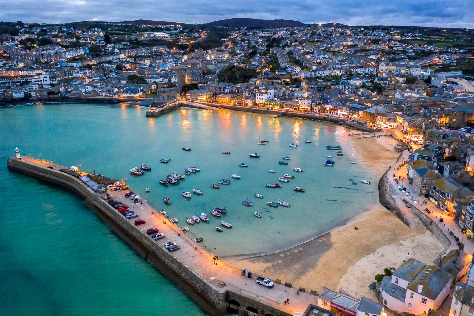
When morning begins in St Ives, it does not break—it glows.
The sun rises as if softening itself for the sake of the Atlantic, casting diluted gold across whitewashed cottages, wet sand, and the wide curve of Porthmeor Beach. Light arrives here in layers: pearl first, then mist-blue, then a silver that seems to float rather than shine. This St Ives color story begins not with drama, but with clarity—a clarity so complete that artists chase it, sailors trust it, and clouds seem unable to lie within it.
Here, horizons do not stay still.
They ripple, tilt, shimmer. The tide pulls back to reveal bronze-green seaweed terraces; it returns with sheets of turquoise that switch to navy in minutes; it drapes the harbor walls in reflections that look like trembling brushstrokes. Wind reshapes everything. Even granite headlands—grey, stubborn, thousands of years old—look softened under the Cornish light. If Big Bend is a library of stone, St Ives is a studio of shifting water—every color a moving thought, every surface a fragment of sky in translation.

At noon, the town becomes a lens.
Shadows blur; roofs brighten; the sea burns bright enough to erase distance. But look more carefully and the palette deepens: the water near the harbor is tea-green; the wet sand carries faint rose; fishing boats peel into ochre, rust, and weathered pine; gull wings catch flashes of white so sharp they feel metallic. What people call “blue” here is actually a spectrum—one stitched from cloud, tide, salt, depth, and the memory of storms.
From this maritime landscape emerges a light-born chromatic vocabulary:
- Harbor Mist — pale grey-blue softened by morning fog.
- Artist’s Pearl — satin-white daylight reflected off seawalls.
- Cornish Turquoise — shallow-water glow unique to St Ives coves.
- Gannet Wing — crisp coastal white with hints of silver.
- Weathered Granite — warm grey from tide-touched stone.
- Salt Rose — blush-tinted sand under low sun.
- Storm Indigo — deep-blue heavy with approaching rain.
- Mariner’s Ochre — boat paint chipped by decades of salt.
- Seafoam Mint — the fleeting pastel of breaking waves.
- Slate Horizon — distant water merging into cloudline.
- Copper Drift — metallic warmth from old fishing gear.
- Tidepool Green — still-water transparency over dark rock.
Each tone here is not color alone—it is an interaction of light and water.
“Harbor Mist” forms only when fog meets sun; “Cornish Turquoise” exists only when tides hit the sand at the right angle; “Storm Indigo” is a pressure change before weather. Nothing in St Ives is static. The palette is a record of movement, atmosphere, and the coastline’s constant act of becoming.

At night, the language shifts again.
Harbor lamps scatter gold across black water; fishing boats rock under pinpricks of reflected starlight; narrow alleys hold deep shadow and faint blue echoes. Even darkness here is not heavy—it is alive with glints and edges. “Storm Indigo” becomes softer; “Artist’s Pearl” dims to moonlit cream; “Slate Horizon” thickens like ink. The sea, which roared all day, whispers now, and every color lowers its voice.
For designers, painters, and gel formulators, St Ives offers something rare:
a palette built not from objects, but from conditions—from tide, wind, humidity, and light. Color here is not a thing; it is a moment. And moments must be captured with precision, restraint, and a sensitivity to subtle change.
When the shifting palette of St Ives enters Yichun Gel Factory, it meets a new discipline: measured viscosity, controlled opacity, calibrated luminosity, and repeatability across thousands of bottles. The emotional softness of ocean color becomes a technical challenge:
how to translate reflected light into pigment?
How to give water clarity to a film that must cure under UV?
How to make granite texture without roughness?

In Yichun’s design approach, the goal is not imitation—it is resonance. Each shade must express:
- Fluidity — whether the color reads as moving or still.
- Atmospheric softness — the level of diffusion or clarity.
- Reflective memory — how it catches light at low angles.
- Emotional temperature — calm, bright, moody, or quietly powerful.
With this framework, the St Ives palette separates into functional color families:
- Harbor Mist and Artist’s Pearl become builder bases and soft opaque gels, offering clean, bright foundations that echo morning light on seawalls.
- Cornish Turquoise, Seafoam Mint, and Tidepool Green emerge as jelly gels, capturing translucency without losing chroma.
- Storm Indigo and Slate Horizon transform into deep, stable blue-blacks—moody, elegant, anti-fading in salon light.
- Salt Rose becomes a sheer blush gel, used as a universal tone-enhancer across skin tones.
- Weathered Granite and Mariner’s Ochre inspire textured metallics, with controlled shimmer reminiscent of sunlit stone and aged boat rails.
- Copper Drift becomes a micro-metallic liner gel, perfect for accents and wave-like micro-stripes.
Every batch is tested not only for shade accuracy but for behavior under light:
Does “Cornish Turquoise” maintain vibrancy under cool LEDs?
Does “Storm Indigo” stay clean and not green-shift after curing?
Does “Artist’s Pearl” diffuse light softly without chalkiness?
Particle size, resin clarity, and pigment ratio are adjusted until the formula captures not only the color, but the feeling of St Ives light itself.

Within Yichun’s product system, St Ives unfolds as a multi-range collection:
1. Atlantic Veil Jelly Series
“Cornish Turquoise,” “Seafoam Mint,” and “Tidepool Green.”
These translucent gels create watercolor effects, soft gradients, and airy ocean-layer designs—perfect for brands focusing on coastal, clean-aesthetic nail trends.
2. Harbor Light Builder & Rubber Base Line
“Harbor Mist,” “Artist’s Pearl,” and “Salt Rose.”
These universal neutrals offer high wearability while carrying the clarity of coastal morning light. Ideal for minimalist brands and salons seeking soft, bright, skin-flattering tones.
3. Stormfront Deep Gel Series
“Storm Indigo” and “Slate Horizon.”
Dark, moody, stable under all lighting. Inspired by the Atlantic during changing weather, suitable for autumn/winter collections or sophisticated editorial sets.
4. Mariner Metallic & Mineral Line
“Copper Drift,” “Mariner’s Ochre,” and “Weathered Granite.”
Fine metallic gels for accents and professional detailing, capturing the industrial beauty of boats, ropes, and tide-worn metal.
5. Breakwater Shimmer Toppers
Ultra-sheer toppers with micro-silver particles, referencing moonlight over waves.
Designed for subtle elegance, not glitter overload.
Across all categories, the St Ives palette avoids neon intensity or sugary pastel sweetness.
Instead, it embraces coastal restraint: soft tones, gentle reflections, and colors that feel lived-in by wind, salt, and time.

A St Ives–inspired packaging system draws from its characteristic textures:
- Primary Box Tones
Outer box: soft “Harbor Mist” matte grey-blue with a touch of chalky seaside texture.
Accent spine/panel: “Cornish Turquoise” or “Storm Indigo,” like a brushstroke of ocean against stone. - Bottle Design
Matte bottles in Artist’s Pearl, Salt Rose, or Weathered Granite.
Caps in metallic Copper Drift or satin Storm Indigo, giving vertical visual weight. - Printing & Finishes
Foil: cool silver or champagne gold—light, not flashy.
Texture: optional fine sand-touch UV coating for tactile realism.
Spot gloss used sparingly to mimic wet stone or reflective tide lines. - Color Card
Arranged as horizontal bands like a seascape: sky, horizon, water, sand, stone.
Muted backgrounds ensure the blues and greens glow naturally.
This is not a “beach-themed” collection with seashell graphics.
It is coastal minimalism, tuned for premium brands and design-conscious salons.

St Ives is often described as beautiful, but beauty is not its deepest offering.
The town teaches something subtler: the discipline of seeing.
Details sharpen here. Edges become soft, then firm, then soft again. Light changes mood every twenty minutes. Waves rewrite the shoreline continuously.
For creators, St Ives poses three questions:
- What happens to design when light, not pigment, becomes the guiding force?
- Can a color system feel both calm and alive, like a tide that never fully repeats itself?
- How might a brand express clarity, softness, and atmospheric depth instead of loud saturation?
Each bottle in this collection becomes more than a shade—it becomes a moment of weather, a piece of coastline stabilized into color.
A fragment of a place where sea and sky collaborate to paint the day, over and over, endlessly.
📍 Location
St Ives, Cornwall, United Kingdom
Coordinates: 50.2110° N, 5.4810° W