

High above the tree line, sound begins to thin.
At Whistler Blackcomb, the mountain does not announce itself with drama.
There is no sudden spectacle, no singular moment of arrival. Instead, elevation accumulates quietly. Air sharpens. Colors lose warmth. Gravity becomes perceptible—not as force, but as presence.
Snow does not fall here.
It settles.
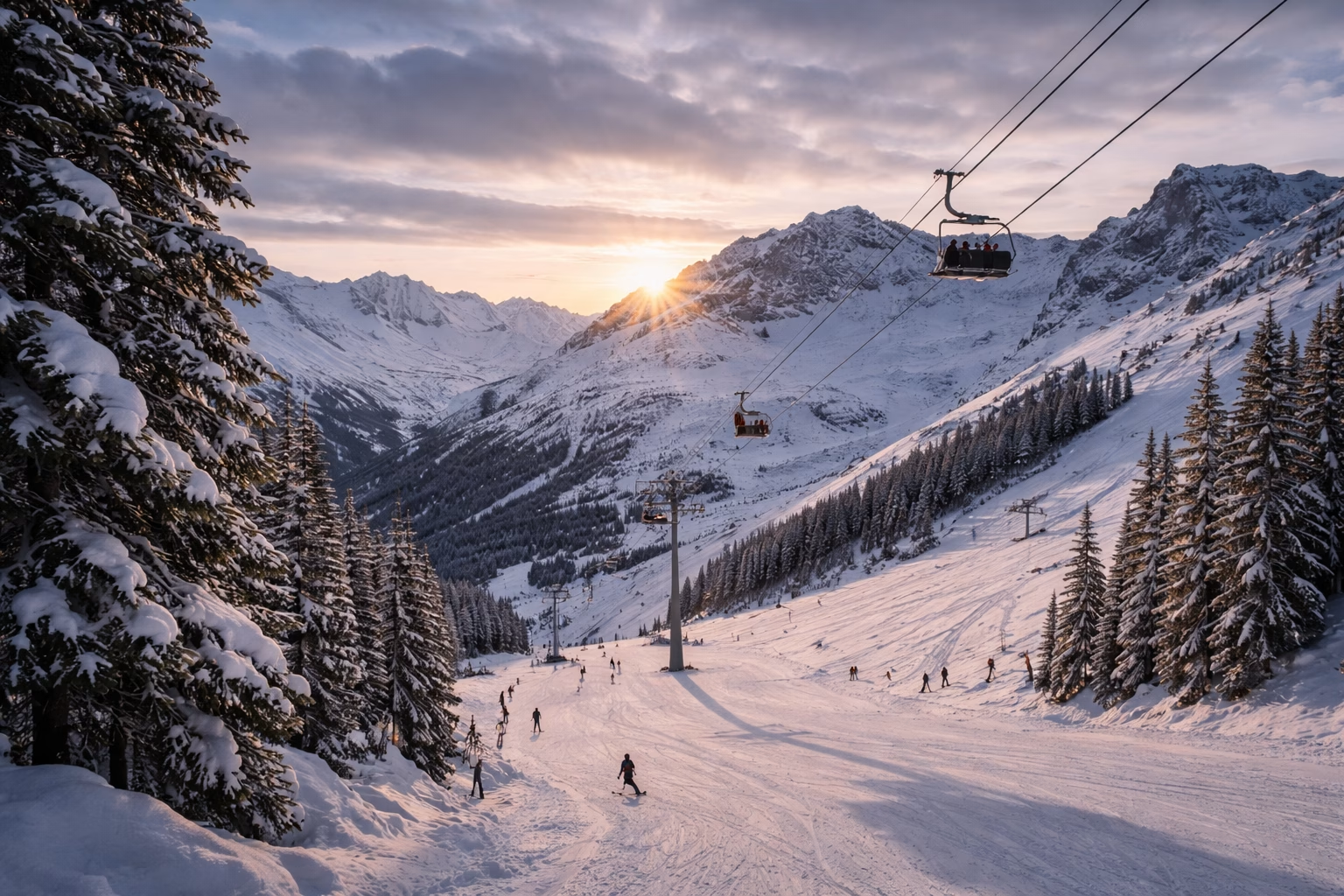
The first light of morning touches the alpine bowls in muted bands: a pale blue-grey sliding over compressed snowfields, a graphite shadow stretching beneath ridgelines, a faint silver glint where ice crystals catch the sun at a low angle. Everything feels restrained. Calibrated. Held.
This is not a landscape of contrast.
It is a landscape of control.
At Whistler Blackcomb, color behaves the way snow behaves—
compressed, layered, directional, and weight-bearing.
Nothing is decorative.
Everything is structural.
A Mountain Built for Vertical Thinking
Whistler Blackcomb sits within the southern Coast Mountains of British Columbia, where tectonic uplift and glacial erosion have produced a terrain defined less by surface texture and more by vertical logic.
This is a mountain system shaped by:
- Repeated glaciation
- Freeze–thaw fracture cycles
- Persistent snow load
- Wind-driven redistribution of ice and particulate matter
Unlike agricultural or coastal landscapes—where color diffuses outward—Whistler’s palette is built top-down.
Gravity is the primary compositor.
Snow compacts over time into distinct density layers. Ice lenses form beneath pressure. Rock faces oxidize unevenly, depending on exposure, moisture retention, and snow cover duration. Vegetation appears only where the mountain allows it—dark, resinous, vertical forms anchoring themselves against slope and cold.
Color here is never broad.
It is banded.
The Physics of Cold Color
Cold environments strip color of excess.
At sub-zero temperatures, saturation collapses first. Warm wavelengths recede. What remains is a narrow, disciplined spectrum dominated by:
- Blue-shifted whites
- Mineral greys
- Iron-darkened charcoals
- Resin greens
- Shadow blacks
At Whistler Blackcomb, these tones are not symbolic.
They are physical consequences.
Snow reflects up to 90% of visible light, but only when freshly fallen. As it compresses, absorbs particulate matter, and partially melts, its reflectivity drops, shifting from luminous white to blue-grey, then to dull graphite. Ice refracts light directionally, producing fleeting silver flashes rather than sparkle.
Rock faces—granodiorite, basaltic intrusions, iron-bearing sediments—oxidize slowly beneath snowmelt, developing matte umber and cold rust undertones that only appear in late season.
This is not a palette that evolves daily.
It evolves by season and by pressure.
The Whistler Blackcomb Color Field
From summit ridge to forest floor, the mountain reveals a restrained but deeply complex palette:
- Summit Ice White — compressed snow under high reflectance, slightly blue-shifted
- Glacier Fog Grey — wind-scoured snowfields with particulate shadow
- Steel Ridge Blue — distant alpine bowls under oblique light
- Basalt Charcoal — exposed rock faces after snow retreat
- Iron Melt Umber — oxidized stone where meltwater concentrates
- Fir Needle Green — cold, resin-rich evergreen canopy
- Shadow Pine Black — dense forest interiors with near-total light absorption
- Avalanche Dust Taupe — mixed snow, soil, and stone at run-out zones
- Ice Lens Silver — transient highlights on frozen surfaces
- Twilight Slate — late-afternoon mountain shadow bands
- Nightfall Ink — complete chromatic collapse after sunset
None of these colors exist alone.
They stack.
They compress.
They bear weight.

Material Behaviors, Not Visual Effects
What makes Whistler Blackcomb exceptional as a color system is not its range—but its behavior under stress.
Each dominant tone corresponds to a physical property:
- Summit Ice White
→ High opacity, high reflectance, low warmth
→ Demands ultra-clean pigment dispersion without chalking - Glacier Fog Grey
→ Micro-particulate diffusion
→ Requires soft-focus pigment architecture, never flat - Basalt Charcoal
→ Dense mineral load
→ Must remain deep without visual heaviness - Fir Needle Green
→ Narrow hue window
→ Saturation must be restrained, resinous, controlled - Nightfall Ink
→ Near-total absorption
→ Black without shine, depth without glare
This is a palette that rejects shimmer as ornament.
If reflectivity appears, it must behave like ice—not glitter.
Vertical Silence as Design Principle
Standing at elevation, one becomes aware of a different kind of quiet.
Not absence—but containment.
Sound does not travel far. Wind absorbs it. Snow muffles it. The mountain feels sealed, like a closed system maintaining internal balance.
This silence has color.
It lives in compressed greys, in matte blacks, in whites that refuse to glow. It is the opposite of coastal brightness or vineyard warmth. It is not inviting. It is precise.
For designers, this offers a rare lesson:
Color does not need to express emotion loudly
to be emotionally powerful.
At Whistler Blackcomb, restraint is the emotion.

Seasonal Compression and Release
How the Mountain Changes Color Without Changing Tone
At Whistler Blackcomb, seasons do not replace one another.
They rearrange pressure.
Winter does not introduce color—it removes it.
Spring does not brighten the mountain—it exposes what was already there.
During peak winter, the landscape is visually compressed. Snow load flattens contrast, absorbs texture, and seals the ground beneath a continuous white-grey envelope. The palette narrows to a disciplined range: ice white, fog grey, slate shadow.
As temperatures rise, the mountain does not bloom.
It reveals.
Snow retreats vertically, not horizontally. Upper bowls release first, exposing dark stone bands beneath lingering snow shelves. Meltwater traces iron paths across rock faces, briefly intensifying umbers and rusts before drying back into matte quiet.
The key here is not transformation—but controlled release.
Color at Whistler does not cycle wildly.
It tightens, then loosens.
Temporal Color: Reading Time Through Pressure
Unlike agricultural landscapes where color signals ripeness, or coastal systems where color follows tides, Whistler’s palette tracks mechanical duration.
Time is felt as:
- Snow compression
- Ice lens formation
- Gradual exposure of substrate
- Slow oxidation under meltwater
A north-facing slope may hold winter tones well into late spring, while a south-facing ridge transitions weeks earlier—creating vertical color stratification across the same mountain face.
This produces a unique phenomenon:
Multiple seasons coexisting in one visual field
White persists above.
Charcoal emerges below.
Greens wait at the margins.
Color becomes a map of pressure history, not calendar time.
Translating Cold Physics into Design Logic
Whistler Blackcomb does not inspire abundance.
It inspires precision.
When this landscape enters design thinking, the translation is not literal. Snow is not copied. Ice is not mimicked. Instead, the physical rules governing the mountain become design constraints.
Core Translation Principles
Compression over Spread
Color systems should feel compact, never expansive.
Opacity over Transparency
Snow teaches that clarity does not require translucency.
Directional Reflectivity
Any shine must behave like ice—brief, angular, conditional.
Vertical Hierarchy
Tonal systems should stack, not blend.
This is a color philosophy rooted in load-bearing behavior.

Alpine Color Systems in Product Logic
1. Snow-Load Cream Gels
Keywords: cream gel polish, solid color gel
Inspired by Summit Ice White and Glacier Fog Grey.
Design logic:
- Ultra-high opacity in 1 coat
- No chalking under strong light
- Neutral temperature control (no yellow shift)
These colors function as foundations—structural, reliable, uncompromising.
2. Ice-Lens Reflective Accents
Keywords: subtle shimmer gel, ice-effect gel
Used sparingly and precisely.
Design logic:
- Micro-reflective particles only
- Directional reflection (not sparkle)
- Light response limited to specific angles
Reflection should appear, then disappear—
never remain constant.
3. Alpine Shadow Deep Tones
Keywords: black gel polish, dark neutral gel
Inspired by Basalt Charcoal and Nightfall Ink.
Design logic:
- Maximum depth without gloss glare
- Smooth dispersion to avoid patchiness
- Matte compatibility without flattening
These tones anchor the system.
They do not decorate—it is the other colors that orbit them.
4. Resin Forest Greens
Keywords: dark green gel polish, evergreen tones
Inspired by Fir Needle Green.
Design logic:
- Narrow hue window
- Low saturation ceiling
- Controlled undertone warmth
Green here must feel functional, not botanical.

Visual & Packaging Interpretation
Pressure Made Visible
A Whistler Blackcomb–inspired visual system should feel compressed and vertical.
Primary Tones
- Summit Ice White
- Basalt Charcoal
Secondary Anchors
- Glacier Fog Grey
- Fir Needle Green
Surface Treatments
- Dense matte coatings
- Fine-grain textures
- Minimal reflectivity
Metal Accents
- Cold silver
- Brushed platinum
- Muted gunmetal
Structural Layout
- Vertical typography
- Narrow margins
- Strong top-down alignment
Packaging should feel weight-bearing, like equipment—not ornament.
Nothing playful.
Nothing casual.

Emotional Register
Calm Under Load
Whistler Blackcomb does not comfort.
It stabilizes.
The palette communicates discipline, focus, and endurance. It feels composed under pressure, confident without excess.
This is color for environments that require clarity:
- Professional
- High-performance
- Serious
The emotional temperature is cold—but not distant.
It is controlled.
Tonal Reflection
Whistler Blackcomb teaches that color can function like architecture.
That whiteness can carry weight.
That darkness can provide stability.
That restraint can feel expansive when applied with intention.
Here, color is not a surface choice.
It is a response to gravity.
Snow compresses.
Stone holds.
Light obeys angle.
And in that obedience, a system emerges—
quiet, precise, and enduring.
Location Reference
Coordinates: 50.1150° N, 122.9480° W
Landmark: Whistler Blackcomb
Region: British Columbia
Country: Canada