

When morning mist lifts over Chatsworth House, the estate does not awaken suddenly.
It exhales.
First, a soft gleam of pale gold touches the stone balustrades; then the dew recedes across the rolling Derbyshire fields; then the great façade—grand yet strangely humane—reveals itself in full. In this quiet unfurling, the Chatsworth color story begins not with drama but with an orchestration of textures: stone warmed by centuries of touch, water moving in reflective silence, gilded details glowing with a confidence earned over time.
Here, every surface remembers something.
The terrace stones carry the low shine of footsteps from another century.
The gilded window frames hold the breath of long conversations.
The lawns undulate like green fabric tailored by landscape architects who believed beauty was not a luxury but a civic duty.
Nothing at Chatsworth feels accidental.
Nothing feels hurried.
The palette itself seems curated by memory—shades of heritage rather than ornamentation.
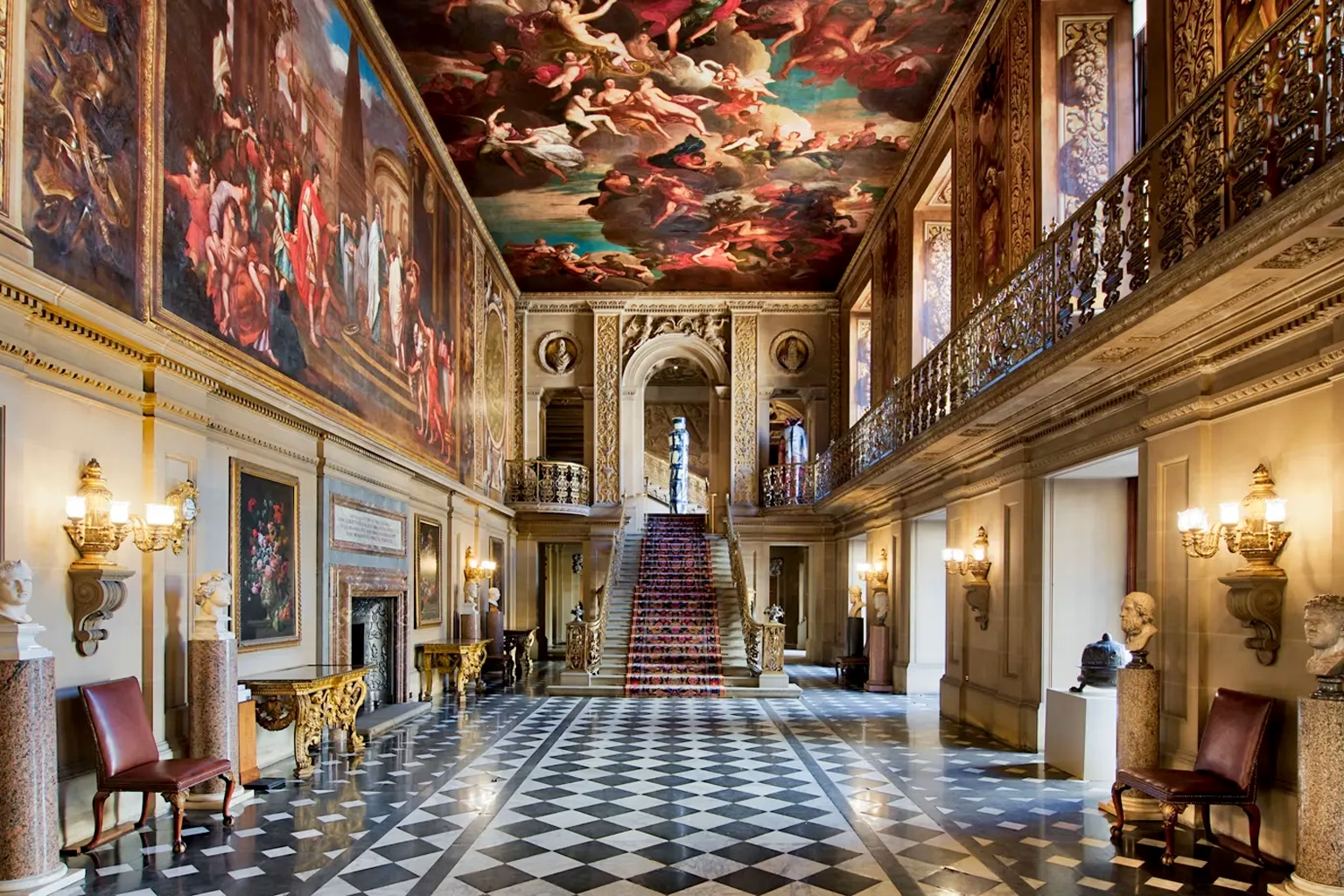
Chatsworth’s palette does not shout; it accumulates.
Under mid-day light, the honey-colored sandstone of the façade shifts toward warm ochre.
In shadow, it cools, taking on hints of taupe and mellow grey.
Nearby, the gardens widen into a spectrum of greens—sage, moss, olive—each softened by England’s humidity. The water terrace contributes its own chromatic vocabulary: silver reflections, muted slate blues, occasional streaks of rose where late sunlight catches marble surfaces.
From this interplay of stone, glass, leaf, and water emerges a precise, estate-born color language:
- Chatsworth Gold — restrained gilding that glows without glitter.
- Estate Sandstone — honey-tan stone warmed by centuries of sun.
- Derbyshire Moss — soft, velvety green under high humidity.
- Library Umber — deep brown leather softened by age and handling.
- Gallery Cream — pale, diffused light reflecting off painted ceilings.
- Marble Rose — faint pink veining in centuries-old stone.
- Lake Mirror Blue — cool reflections on quiet water.
- Ornamental Iron Black — wrought-iron gates dampened by rain.
- Evening Parlor Mauve — twilight settling through tall windows.
- Gilded Ember — gold leaf touched by late-afternoon sun.
- Portrait Sepia — tones softened by varnish and time.
- Silk Hallway Grey — woven neutrals from tapestries and upholstery.
Each tone feels like a continuation of something—the residue of a moment carried forward instead of erased.
Chatsworth teaches a subtle truth:
luxury is not brightness; luxury is continuity.
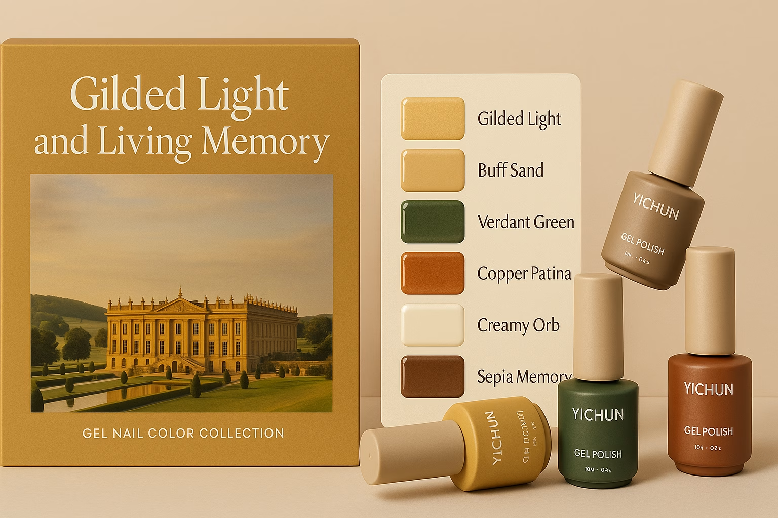
When this atmosphere travels from Derbyshire to the sterile precision of Yichun Gel Fabrik, something alchemical occurs.
The grandeur of the estate—its stone, its gilding, its textures—is translated not literally but structurally.
Color stops being merely a visual attribute. It becomes:
- Weight – how grounded or airy a shade feels on the nail.
- Glow – whether light escapes softly or sharply from the cured film.
- Historical resonance – whether a tone feels modern, antique, or timeless.
- Surface memory – whether the finish recalls stone, silk, metal, or parchment.
Yichun formulators do not imitate Chatsworth; they interpret es.

Thus the palette is deconstructed into laboratory functions:
- Estate Sandstone und Gallery Cream become the foundation of builder gels und rubber bases—quiet, cultured neutrals that echo the estate walls.
- Chatsworth Gold und Gilded Ember evolve into metallic liners und cat-eye gels, where reflective mica replicates the controlled shine of gold-leaf ornamentation.
- Derbyshire Moss und Silk Hallway Grey become wearable jellies—soft, breathable tones with a gentle translucency like old glass.
- Marble Rose und Library Umber inspire opaque color gels with dense, velvety undertones.
- Lake Mirror Blue contributes to sheer toppers, scattering light like water under overcast sky.
Every color is tested for behavior, not just appearance:
- Does the translucency feel natural or synthetic?
- Does the metallic reflect in broad sheets or fine lines?
- Does the shade stay elegant under both warm and cool lighting?
- Does it feel like heritage—or like imitation gold?
The lab formulates until the color behaves like a memory, not merely a pigment.

Within the Yichun system, the Chatsworth story becomes a multi-chapter product family, each line honoring one part of the estate’s visual soul.
1. Estate Light Jelly Gel Collection
Soft neutrals—Gallery Cream, Silk Hallway Grey, and Lake Mirror Blue—become diffused jelly gels for serene manicures. Their translucency mirrors indoor sunlight filtered through carved windows.
2. Sandstone Foundation Builder & Rubber Base Series
Estate Sandstone, Marble Rose, and muted Portrait Sepia develop into everyday wearable bases—shades that feel like quiet confidence rather than cosmetic decoration.
3. Gilded Hall Magnetic Cat Eye Line
Chatsworth Gold, Gilded Ember, and Iron Black are transformed into structured cat-eye gels, where light moves across the nail as precisely as sun across gilded moldings.
4. Derbyshire Garden Opaque Series
Library Umber, Derbyshire Moss, and Evening Parlor Mauve become rich, opaque color gels that evoke old tapestries, leather-bound books, and twilight gatherings.
5. Mirror Lake Subtle Shimmer Toppers
Inspired by water and soft English light, these toppers use extremely fine particles—never sparkly, always graceful.
Across all series, one principle holds:
Elegance is controlled, not maximal.
Chatsworth’s color identity relies on the confidence to stop before excess.

A Chatsworth-inspired collection must look and feel like an extension of heritage design.
Primary Box Aesthetic
Outer box: Estate Sandstone matte finish with a stone-texture micrograin.
Accent spine: Gilded Ember or Chatsworth Gold—a vertical line mirroring classical columns.
Flaschen-Design
Bottles: Warm neutrals—Marble Rose, Soft Cream, Porcelain Taupe—with soft-touch surfaces resembling aged plaster or waxed stone.
Caps: Metallic finishes in muted gold or iron black, referencing doorknobs and gates.
Print & Finishes
Logo: refined serif or minimalist sans serif, rendered in low-shine gold foil.
Texture options:
– matte + selective gloss to mimic gilded carving highlights
– micro-sand varnish for tactile stone feel
– faint marbling to echo the sculpture gallery
Color Card Design
Swatches arranged like gallery wall panels: clean, symmetrical, quiet.
Backgrounds in Gallery Cream ensure all shades feel curated, not crowded.
The message is unmistakable:
This is heritage modernism—where historical aesthetics meet contemporary formulation discipline.

Chatsworth is often described as “stately,” but this word misses its depth.
Standing before the façade, you realize the estate is not imposing—it is enduring.
Its beauty comes not from extravagance but from consistency, maintained across centuries.
Its palette is not flamboyant; it is reassuring.
Its atmosphere is not loud; it is attentive.
For Yichun’s designers and clients, Chatsworth becomes a philosophical lens:
- What does it mean for a color to feel “cultured”?
- Can a gel polish embody heritage without appearing antique?
- How can packaging communicate trust, refinement, and time-tested quality?
- How might a brand position itself as a modern heir to tradition, the way Chatsworth stands as a living archive of English craftsmanship?
Chatsworth teaches that elegance is not a trend—it is a behavior.
And every bottle in this collection becomes a small, portable expression of that truth.
📍 Standort
Chatsworth House, Derbyshire, England
Koordinaten: 53.2270° N, 1.6100° W